library(mvtnorm)
library(hetGP)
library(ggplot2)
library(MASS)VectorByte Methods Training: Introduction to Gaussian Processes for Time Dependent Data (Practical)
Objectives
This practical will lead you through fitting a few versions of GPs using the R package: hetGP (Binois and Gramacy 2021). We will begin with a toy example from the lecture and then move on to a real data example to forecast tick abundances for a NEON site.
Basics: Fitting a GP Model
Here’s our function from before: Y(x) = 5 \sin(x) Now, let’s learn how we actually use the library laGP to fit a GP and make predictions at new locations. Let’s begin by loading some libraries
Now we create the data for our example. (X, y) is our given data,
# number of data points
n <- 8

# Inputs - between 0 and 2pi
X <- matrix(seq(0, 2*pi, length= n), ncol=1)

# Creating the response using the formula
y <- 5*sin(X)
We will use the mleHomGP function to fit the GP. In this function, we need to pass in our inputs, outputs. There are options to set parameter values which can be explored using ?mleHomGP. We will try some adjustments shortly
Key Arguments: - X indicates the input which must be a matrix - Z is used for response which is a vector
Here, we specify theta using the argument known.
# Fitting GP
gp <- mleHomGP(X = X, Z = y, known = list(theta = 1))

# Print output
gp
N = 8 n = 8 d = 1
Gaussian covariance lengthscale values: 1
Homoskedastic nugget value: 1.490116e-08
Variance/scale hyperparameter: 7.525826
Estimated constant trend value: -4.810453e-16
MLE optimization:
Log-likelihood = -18.49988 ; Nb of evaluations (obj, gradient) by L-BFGS-B: 2 2 ; message: ERROR: ABNORMAL_TERMINATION_IN_LNSRCH As we see, model contains information about basic information such as sample size, dimensionality etc. Next, we see the estimates for length-scale, nugget and scale. The mean \mu for the data is also estimated (constaant trend). We don’t necessarily use this information manually; it’s simply to understand what output we have.
We will use XX as our predictive set i.e. we want to make predictions at those input locations. Here, we will create a vector of 100 points between -0.5 and 2 \pi + 0.5. We are essentially using 8 data points to make predictions at 100 points. We can use the predict function to do this.
We need to pass our GP object as gpi = gpi (in our case) and the predictive input locations XX = XX for this.
# Predictions

# Creating a prediction set: sequence from -0.5 to 2*pi + 0.5 with 100 evenly spaced points
XX <- matrix(seq(-0.5, 2*pi + 0.5, length= 100), ncol=1)

# Using the function to make predictions using our gpi object
yy <- predict(object = gp, x = XX)

# This will tell us the results that we have stored.
names(yy)
[1] "mean" "sd2" "nugs" "cov" names(yy) will tell us what is stored in yy. As we can see, we have the mean i.e. the mean predictions \mu and, sd2 ie the diagonal variances, nugs contain the nuggets on the diagonal.
To obtain the variance at new predictive locations, we must add sd2 and nugs
mean <- yy$mean # store mean
s2 <- yy$sd2 + yy$nugs # store variance
To obtain the full Sigma matrix (cov), we must modify the predict command.
# Using the function and pass xprime as the new X matrix to get Sigma(XX, XX)
yy <- predict(object = gp, x = XX, xprime = XX)

# This is the covariance structure. This too does not include the nugget term.
Kn <- yy$cov
Sigma <- Kn + diag(yy$nugs) # this is our predictive sigma of interest
# Since our posterior is a distribution, we take 100 samples from this.
YY <- rmvnorm (100, mean = mean, sigma = Sigma, checkSymmetry = F)
# We calculate the 95% bounds
q1 <- yy$mean + qnorm(0.025, 0, sqrt(s2))
q2 <- yy$mean + qnorm(0.975, 0, sqrt(s2))
trueYY <- 5 * sin(XX)Now, we will plot the mean prediction and the bounds along with each of our 100 draws.
matplot(XX, t(YY), type = 'l', col = "gray", lty = 1)
matlines(XX, mean, col = "red", lty = 1, lwd = 2)
matlines(XX, q1, col = "red", lty = 2, lwd = 3)
matlines(XX, q2, col = "red", lty = 2, lwd = 3)
matlines(XX, trueYY, col = "blue", lty = 1, lwd = 2)
matpoints(X, y, col = "black", cex = 1.5, pch = 19)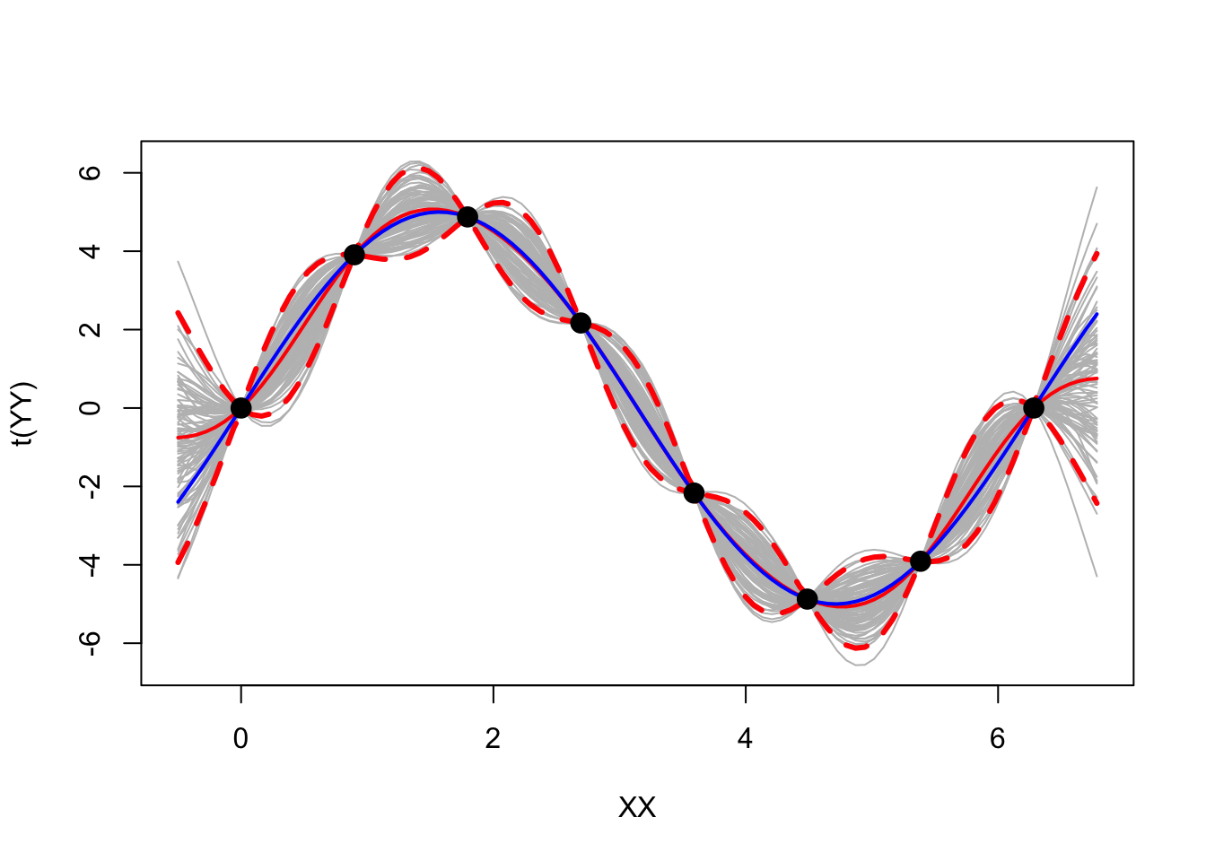
Looks pretty cool.
Using GPs for data on tick abundances over time
We will try all this on a simple dataset: Tick Data from NEON Forecasting Challenge We will first learn a little bit about this dataset, followed by setting up our predictors and using them in our model to predict tick density for the future season. We will also learn how to fit a some basics about a HetGP (Heteroskedastic GP) and try and fit that model as well.
Overview of the Data
Objective: Forecast tick density for 4 weeks into the future
Sites: The data is collected across 9 different sites, each plot was of size 1600m^2 using a drag cloth
Data: Sparse and irregularly spaced. We only have ~650 observations across 10 years at 9 locations
Let’s start with loading all the libraries that we will need, load our data and understand what we have.
library(tidyverse)
library(hetGP)
library(ggplot2)

# Pulling the data from the NEON data base.
target <- readr::read_csv("https://data.ecoforecast.org/neon4cast-targets/ticks/ticks-targets.csv.gz", guess_max = 1e1)

# Visualizing the data
head(target)
# A tibble: 6 × 5
datetime site_id variable observation iso_week
<date> <chr> <chr> <dbl> <chr>
1 2015-04-20 BLAN amblyomma_americanum 0 2015-W17
2 2015-05-11 BLAN amblyomma_americanum 9.82 2015-W20
3 2015-06-01 BLAN amblyomma_americanum 10 2015-W23
4 2015-06-08 BLAN amblyomma_americanum 19.4 2015-W24
5 2015-06-22 BLAN amblyomma_americanum 3.14 2015-W26
6 2015-07-13 BLAN amblyomma_americanum 3.66 2015-W29Initial Setup
For a GP model, we assume the response (Y) should be normally distributed.
Since tick density, our response, must be greater than 0, we need to use a transform.
The following is the most suitable transform for our application:
\begin{equation} \begin{aligned} f(y) & = \log (y + 1) \\[2pt] \end{aligned} \end{equation}
We pass in (response + 1) into this function to ensure we don’t take a log of 0. We will adjust this in our back transform.
Let’s write a function for this, as well as the inverse of the transform.
# transforms y
f <- function(x) {
  y <- log(x + 1)
  return(y)
}

# This function back transforms the input argument
fi <- function(y) {
  x <- exp(y) - 1
  return(x)
}
Predictors
The goal is to forecast tick populations for a season so,
- Y: tick density.
We must choose predictors that will help forecast Y. We will use
- X1 Iso-week: This is the iso week of collection. We can write a function to identify it given the date.
fx.iso_week <- function(datetime){
  startdate <- min(datetime) # identify start week
  x1 <- as.numeric(stringr::str_sub(ISOweek::ISOweek(datetime),7, 8)) # find iso week #
  return(x1)
}- X_2 Sine wave: We use this to give our model phases. We can consider this as a proxy to some other variables such as temperature which would increase from Jan to about Jun-July and then decrease. We use the following sin wave
X_2 = \left( \text{sin} \ \left( \frac{2 \ \pi \ X_1}{106} \right) \right)^2 where, X_1 is the iso-week.
Usually, a Sin wave for a year would have the periodicity of 53 to indicate 53 weeks. Why have we chosen 106 as our period? And we do we square it?
Let’s use a visual to understand that.
x <- c(1:106)
sin_53 <- sin(2*pi*x/53)
sin_106 <- (sin(2*pi*x/106))
sin_106_2 <- (sin(2*pi*x/106))^2

par(mfrow=c(1, 3), mar = c(4, 5, 7, 1), cex.axis = 2, cex.lab = 2, cex.main = 3, font.lab = 2)
plot(x, sin_53, col = 2, pch = 19, ylim = c(-1, 1), ylab = "sin wave",
     main = expression(paste(sin,  " ", (frac(2 * pi * X[1], 53)))))
abline(h = 0, lwd = 2)
plot(x, sin_106, col = 3, pch = 19, ylim = c(-1, 1), ylab = "sin wave",
     main = expression(paste(sin,  " ", (frac(2 * pi * X[1], 106)))))
abline(h = 0, lwd = 2)
plot(x, sin_106_2, col = 4, pch = 19, ylim = c(-1, 1), ylab = "sin wave",
     main = expression(paste(sin^2,  " ", (frac(2 * pi * X[1], 106)))))
abline(h = 0, lwd = 2)
Some observations:
The sin wave (period 53) goes increases from (0, 1) and decreases all the way to -1 before coming back to 0, all within the 53 weeks in the year. But this is not what we want to achieve.
We want the function to increase from Jan - Jun and then start decreasing till Dec. This means, we need a regular sin-wave to span 2 years so we can see this.
We also want the next year to repeat the same pattern i.e. we want to restrict it to [0, 1] interval. Thus, we square the sin wave.
# Then with datetime and the function, we can assign
fx.sin <- function(datetime){
  # identify iso week
  x <- as.numeric(stringr::str_sub(ISOweek::ISOweek(datetime),7, 8)) # find iso week
  # calculate sin value for that week
  x2 <- (sin(2*pi*x/106))^2
  return(x2)
}
For a GP, it’s also useful to ensure that all our X’s are between 0 and 1. Usually this is done by using the following method
X_i^* = \frac{X_i - \min(X)}{\max(X) - \min(X) } where X = (X_1, X_2 ...X_n)
X^* = (X_1^*, X_2^* ... X_n^*) will be the standarized X’s with all X_i^* in the interval [0, 1].
We setup the normalize function for this task. Note that we must normalize week number; sine predictor already lies between [0, 1].
normalize <- function(x, minx, maxx){
  return( (x - minx)/(maxx - minx))
}
Model Fitting
Now, let’s start with modelling. We will start with one random location out of the 9 locations.
# Choose a random site number: Anything between 1-9.
site_number <- 2

# Obtaining site name
site_names <- unique(target$site_id)

# Subsetting all the data at that location
df <- subset(target, target$site_id == site_names[site_number])
head(df)
# A tibble: 6 × 5
datetime site_id variable observation iso_week
<date> <chr> <chr> <dbl> <chr>
1 2015-06-29 KONZ amblyomma_americanum 30 2015-W27
2 2015-07-20 KONZ amblyomma_americanum 10 2015-W30
3 2015-08-10 KONZ amblyomma_americanum 30 2015-W33
4 2015-08-31 KONZ amblyomma_americanum 30 2015-W36
5 2015-09-21 KONZ amblyomma_americanum 20 2015-W39
6 2016-05-02 KONZ amblyomma_americanum 210 2016-W18We will also select only those columns that we are interested in i.e. datetime and obervation. We don’t need site since we are only using one of them.
# extracting only the datetime and obs columns
df <- df[, c("datetime", "observation")]
We will use one site at first and fit a GP and make predictions. For this we first need to divide our data into a training set and a testing set. Since we have time series, we want to divide the data sequentially, i.e. we pick a date and everything before the date is our training set and after is our testing set where we check how well our model performs. We choose the date 2020-12-31.
# Selecting a date before which we consider everything as training data and after this is testing data.
cutoff = as.Date('2022-12-31')
df_train <- subset(df, df$datetime <= cutoff)
df_test <- subset(df, df$datetime > cutoff)
GP Model
Now we will setup our X’s. We already have the functions to do this and can simply pass in the datetime. We then combine X_1 and X_2 to create out input matrix X. Remember, everything is ordered as in our dataset.
# Setting up iso-week and sin wave predictors by calling the functions
X1 <- fx.iso_week(df_train$datetime) # range is 1-53
X2 <- fx.sin(df_train$datetime) # range is 0 to 1

# Centering the iso-week by diving by 53
X1c <- normalize(X1, min(X1), max(X1))

# We combine columns centered X1 and X2, into a matrix as our input space
X <- as.matrix(cbind.data.frame(X1c, X2))
head(X)
X1c X2
[1,] 0.4642857 0.9991219
[2,] 0.5714286 0.9575728
[3,] 0.6785714 0.8587536
[4,] 0.7857143 0.7150326
[5,] 0.8928571 0.5443979
[6,] 0.1428571 0.7669117Next step is to tranform the response to ensure it is normal.
# Extract y: observation from our training model.
y_obs <- df_train$observation

# Transform the response
y <- f(y_obs)
Now, we can use the mleHomGP from hetGP library to fit a GP. We will not specify any parameters.
# Fitting a GP with our data, and some starting values for theta and g
gp <- mleHomGP(X, y)
Now, we will create a grid from the first week in our dataset to 1 year into the future, and predict on the entire time series. We use predict to make predictions.
# Create a grid from start date in our data set to one year in future (so we forecast for next season)
startdate <- as.Date(min(df$datetime))# identify start week
grid_datetime <- seq.Date(startdate, Sys.Date() + 30, by = 7) # create sequence from

# Build the input space for the predictive space (All weeks from 04-2014 to 07-2025)
XXt1 <- fx.iso_week(grid_datetime)
XXt2 <- fx.sin(grid_datetime)

# Standardize
XXt1c <- normalize(XXt1, min(XXt1), max(XXt1))

# Store inputs as a matrix
XXt <- as.matrix(cbind.data.frame(XXt1c, XXt2))

# Make predictions using predGP with the gp object and the predictive set
ppt <- predict(gp, XXt)
Storing the mean and calculating quantiles.
# Now we store the mean as our predicted response i.e. density along with quantiles
yyt <- ppt$mean
q1t <- ppt$mean + qnorm(0.025,0,sqrt(ppt$sd2 + ppt$nugs)) #lower bound
q2t <- ppt$mean + qnorm(0.975,0,sqrt(ppt$sd2 + ppt$nugs)) # upper bound
Now we can plot our data and predictions and see how well our model performed. We need to back transform our predictions to the original scale.
# Back transform our data to original
gp_yy <- fi(yyt)
gp_q1 <- fi(q1t)
gp_q2 <- fi(q2t)

# Plot the observed points
plot(as.Date(df$datetime), df$observation,
       main = paste(site_names[site_number]), col = "black",
       xlab = "Dates" , ylab = "Abundance",
       # xlim = c(as.Date(min(df$datetime)), as.Date(cutoff)),
       ylim = c(min(df_train$observation, gp_yy, gp_q1), max(df_train$observation, gp_yy, gp_q2)* 1.05))

# Plot the testing set data
points(as.Date(df_test$datetime), df_test$observation, col ="black", pch = 19)

# Line to indicate seperation between train and test data
abline(v = as.Date(cutoff), lwd = 2)

# Add the predicted response and the quantiles
lines(grid_datetime, gp_yy, col = 4, lwd = 2)
lines(grid_datetime, gp_q1, col = 4, lwd = 1.2, lty = 2)
lines(grid_datetime, gp_q2, col = 4, lwd = 1.2, lty =2)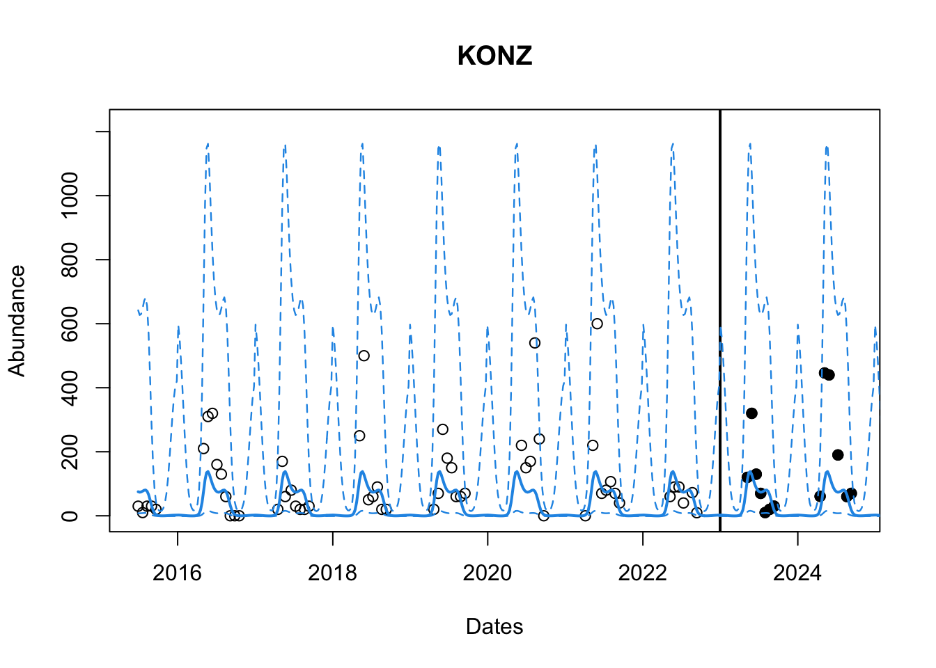
That looks pretty good? We can also look at the RMSE to see how the model performs. It is better o do this on the transformed scale. We will use yyt for this. We need to find those predictions which correspond to the datetime in our testing dataset df_test.
# Obtain true observed values for testing set
yt_true <- f(df_test$observation)

# FInd corresponding predictions from our model in the grid we predicted on
yt_pred <- yyt[which(grid_datetime  %in% df_test$datetime)]

# calculate RMSE
rmse <- sqrt(mean((yt_true - yt_pred)^2))
rmse
[1] 1.039668HetGP Model
Next, we can attempt a hetGP. We are now interested in fitting a vector of nuggets rather than a single value.
Let’s use the same data we have to fit a hetGP. We already have our data (X, y) as well as our prediction set XXt. We use the mleHetGP command to fit a GP and pass in our data. The default covariance structure is the Squared Exponential structure. We use the predict function in base R and pass the hetGP object i.e. het_gpi to make predictions on our set XXt.
# create predictors
X1 <- fx.iso_week(df_train$datetime)
X2 <- fx.sin(df_train$datetime)

# standardize and put into matrix
X1c <- normalize(X1, min(X1), max(X1))
X <- as.matrix(cbind.data.frame(X1c, X2))

# Build prediction grid (From 04-2014 to 07-2025)
XXt1 <- fx.iso_week(grid_datetime)
XXt2 <- fx.sin(grid_datetime)

# standardize and put into matrix
XXt1c <- normalize(XXt1, min(XXt1), max(XXt1))
XXt <- as.matrix(cbind.data.frame(XXt1c, XXt2))

# Transform the training response
y_obs <- df_train$observation
y <- f(y_obs)

# Fit a hetGP model. X must be s matrix and nrow(X) should be same as length(y)
het_gpi <- hetGP::mleHetGP(X = X, Z = y)

# Predictions using the base R predict command with a hetGP object and new locationss
het_ppt <- predict(het_gpi, XXt)
Now we obtain the mean and the confidence bounds as well as transform the data to the original scale.
# Mean density for predictive locations and Confidence bounds
het_yyt <- het_ppt$mean
het_q1t <- qnorm(0.975, het_ppt$mean, sqrt(het_ppt$sd2 + het_ppt$nugs))
het_q2t <- qnorm(0.025, het_ppt$mean, sqrt(het_ppt$sd2 + het_ppt$nugs))

# Back transforming to original scale
het_yy <- fi(het_yyt)
het_q1 <- fi(het_q1t)
het_q2 <- fi(het_q2t)
We can now plot the results similar to before. [Uncomment the code lines to see how a GP vs a HetGP fits the data]
# Plot Original data
plot(as.Date(df$datetime), df$observation,
       main = paste(site_names[site_number]), col = "black",
       xlab = "Dates" , ylab = "Abundance",
       # xlim = c(as.Date(min(df$datetime)), as.Date(cutoff)),
       ylim = c(min(df_train$observation, het_yy, het_q2), max(df_train$observation, het_yy, het_q1)* 1.2))

# Add testing observations
points(as.Date(df_test$datetime), df_test$observation, col ="black", pch = 19)

# Line to indicate our cutoff point
abline(v = as.Date(cutoff), lwd = 2)

# HetGP Model mean predictions and bounds.
lines(grid_datetime, het_yy, col = 2, lwd = 2)
lines(grid_datetime, het_q1, col = 2, lwd = 1.2, lty = 2)
lines(grid_datetime, het_q2, col = 2, lwd = 1.2, lty =2)

legend("topleft", legend = c("Train Y","Test Y", "HetGP preds"),
         col = c(1, 1, 2), lty = c(NA, NA, 1),
         pch = c(1, 19, NA), cex = 0.5)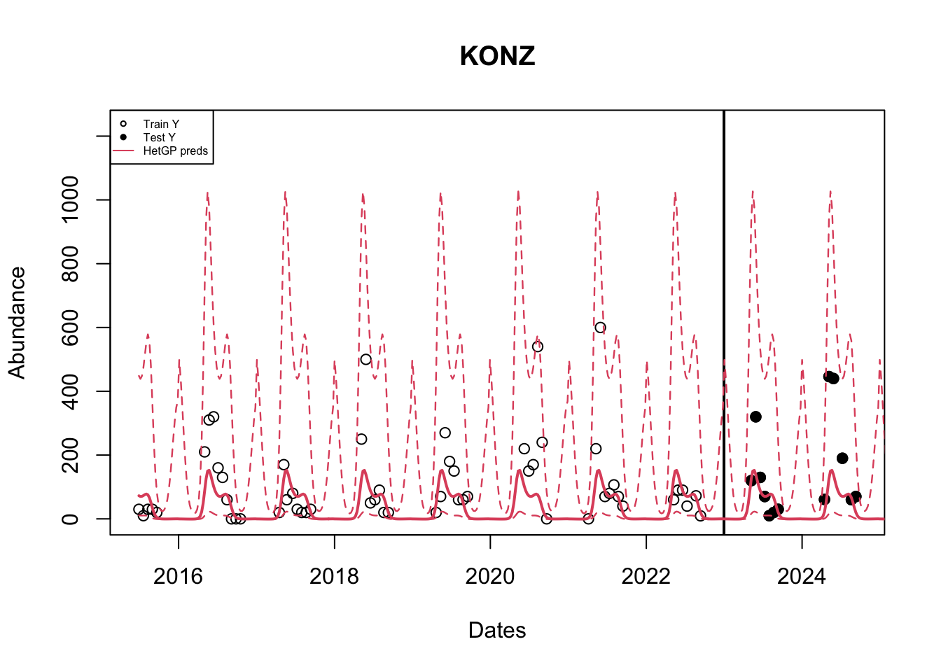
The mean predictions of a GP are similar to that of a hetGP; But the confidence bounds are different. A hetGP produces sligtly tighter bounds.
We can also compare the RMSE’s using the predictions of the hetGP model.
yt_true <- f(df_test$observation) # Original data
het_yt_pred <- het_yyt[which(grid_datetime  %in% df_test$datetime)] # model preds

# calculate rmse for hetGP model
rmse_het <- sqrt(mean((yt_true - het_yt_pred)^2))
rmse_het
[1] 0.980479Now that we have learnt how to fit a GP and a hetGP, it’s time for a challenge.
Try a hetGP on this example.
# Your turn
X <- mcycle$time
y <- mcycle$accel

# Predict on this set
XX <- matrix(seq(0, 301, length= 200), ncol=1)

# Data visualization
plot(X, y, ylim = c(-150, 100))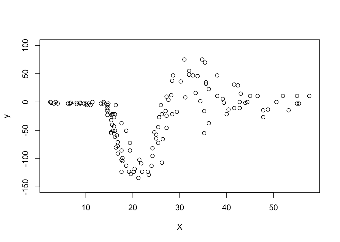
# Add code to fit a hetGP model and visualise it as aboveChallenges
Fit a GP for location “KONZ” i.e. site_number = 2 with X1 = week number
Another predictor that can be used in place of Iso-week (to capture time) is
- X_1 Week Number: The week in which the tick density was recorded starting from week 1. Week number does not repeat itself (unlike iso-week).
The function is setup so you have to enter a datetime. It identifies the start date and the end date is today’s date + 30 days (for short-term future forecasts).
Next, a sequence of weeks is created and labeled \{1, 2, \dots, n\}.
# This function tells us the week number given the date from minimum date to maximum date
fx.week <- function(datetime){
  startdate <- min(datetime) # first week of dataset
  currdate <- Sys.Date() + 30 # today's date + 4 weeks from now

  # the next few lines identify the mondays of the respective weeks
  start_week <-  ISOweek::ISOweek2date(paste0(ISOweek::ISOweek(startdate), "-1"))
  curr_week <- ISOweek::ISOweek2date(paste0(ISOweek::ISOweek(currdate), "-1"))

  # all Mondays in dataset
  all_week <- seq.Date(start_week,curr_week, by = 7)
  x1 <- c()
  for (i in 1:length(datetime)){
    # converting each week to monday
    monday <- ISOweek::ISOweek2date(paste0(ISOweek::ISOweek(datetime[i]), "-1"))
    # setting up week number for that week
    x1[i] <- which(monday == all_week)
  }
  return(x1)
}

target$week <- fx.iso_week(target$datetime)
head(target)
# A tibble: 6 × 6
datetime site_id variable observation iso_week week
<date> <chr> <chr> <dbl> <chr> <dbl>
1 2015-04-20 BLAN amblyomma_americanum 0 2015-W17 17
2 2015-05-11 BLAN amblyomma_americanum 9.82 2015-W20 20
3 2015-06-01 BLAN amblyomma_americanum 10 2015-W23 23
4 2015-06-08 BLAN amblyomma_americanum 19.4 2015-W24 24
5 2015-06-22 BLAN amblyomma_americanum 3.14 2015-W26 26
6 2015-07-13 BLAN amblyomma_americanum 3.66 2015-W29 29Fit a GP Model for all the locations
Hint 1: Write a function that can fit a GP and make predictions (keep it simple. Let arguments be the inputs X, response Y and predictive set XX).
Hint 2: Write a for loop where you subset the data for each location and then call the function to fit the GP.
Q. Do all sites look okay? What do you think is wrong with it?
Train all sites together
Hint: You need a for loop for predictions.
# Write a function which takes in your model and returns mean, s2, q1 and q2

hgp <- function(model, XX){

  return(list(mean, q1, q2, s2))
}

# This is the training data set; remember, we want all sites together

df_train <-

# Build X1, X2 and X3 and normalize.

# Transform the training response

# Fit the model with Xs and Ys
model <-

# We need to predict at each location individually so we can plot with ease. This will also help us for the next challenge.

for(i in 1:9){

  # Subsetting all the data at that location
  dfloc <-

  # Obtain test set at this location

  # Create a grid from start date in our data set to one year in future (so we forecast for   next season)
  startdate <- as.Date(min(dfloc$datetime))# identify start week

  grid_datetime <- seq.Date(startdate, Sys.Date() + 30, by = 7) # create sequence from

  # Built XX and normalize

  # Make Model Predictions
  hetfit <- hgp()

  # Back transforming to original scale
  het_yy <-
  het_q1 <-
  het_q2 <-

  # Plot your results

}
Build altitude predictor for the testing set (Advanced).
Here is a snippet of the function to build the predictor.
site_data <- readr::read_csv(paste0("https://raw.githubusercontent.com/eco4cast/neon4cast-targets/","main/NEON_Field_Site_Metadata_20220412.csv")) |> dplyr::filter(ticks == 1)

site_data <- site_data |> dplyr:::select(field_site_id, field_mean_elevation_m)
colnames(site_data) <- c("site_id", "altitude")

# Scaling altitude between [0, 1]
site_data$altitude <- (site_data$altitude - min(site_data$altitude))/(max(site_data$altitude) - min(site_data$altitude))

fx.alt <- function(df, site_df = site_data, test_site = NULL){
  if(!is.null(test_site)) df <- cbind.data.frame(df, site_id = rep(test_site, length(df)))
  df <- df %>% left_join(site_df, by = "site_id")
  return(df$alt)
}

df <- target[, c("datetime", "site_id", "observation")]
Follow the template above. All you need to do is,
Build X4 = altitude for training set; Add that in your X matrix.
Build XX4 = altitude for testing set (this will be one altitude for the location you are testing at). Add that in your XX matrix
Think about how you should normalize XX4
References
Binois, Mickaël, and Robert B Gramacy. 2021. “Hetgp: Heteroskedastic Gaussian Process Modeling and Sequential Design in r.” Journal of Statistical Software 98: 1–44.
Citation
BibTeX citation:
@online{patil2025,
  author = {Patil, Parul Vijay and Johnson, Leah R. and Gramacy, Robert
    B.},
  title = {VectorByte {Methods} {Training:} {Introduction} to {Gaussian}
    {Processes} for {Time} {Dependent} {Data} {(Practical)}},
  date = {2025-06-10},
  langid = {en}
}
For attribution, please cite this work as:
Patil, Parul Vijay, Leah R. Johnson, and Robert B. Gramacy. 2025.
“VectorByte Methods Training: Introduction to Gaussian Processes
for Time Dependent Data (Practical).” June 10, 2025.